What is the Real Madrid logo's meaning?
Founded in 1902 by a dedicated group of football enthusiasts in Madrid, the club originally known as Madrid Football Club has spent over 124 years defining the pinnacle of athletic excellence. In its inaugural season, the team donned a classic white kit, paired with a primary logo that was as humble as it was ambitious.
This first emblem featured a dark blue "MFC" monogram, standing for Madrid Football Club, designed with sharp, gothic-style serif lettering. The choice of a monogram reflected a trend among early 20th-century sports institutions, emphasizing a personalized, artisanal identity. Throughout its storied existence, the club has transitioned through several major design iterations, evolving from a simple social club into a global powerhouse.
Even when the iconic white shirt is stained with the mud and sweat of a grueling battle on the pitch, the crest remains a beacon of unyielding pride. It stands tall because it represents a trophy cabinet and a history that no other club can replicate. This sense of honor and undeniable charisma is why Spbolivescore invites you to explore the deep-rooted Real Madrid logo's meaning and the mythic journey of the "Merengues."
The evolution and Real Madrid logo's meaning
The genesis of this visual legacy began in 1902 with a deep blue monogram where the letters 'M', 'F', and 'C' were intertwined in a decorative, almost medieval fashion. During these early years, the club functioned as a localized entity, yet its ambition was already evident in the sharp contours of its typography.
By 1908, the design took a more modern turn as the monogram was enclosed within a circle. This circular boundary symbolized unity and the burgeoning professionalization of the sport. The layout was clever: the 'M' followed the curve of the frame, the 'C' sat within the 'M', and the 'F' intersected them both. This era saw the rise of legendary figures and a playing style characterized by raw energy and the foundational spirit of Madrid’s sporting culture.
A transformative shift occurred in 1920 when King Alfonso XIII granted the club the "Real" (Royal) title. To celebrate this prestigious status, an ornate crown was added atop the circular emblem. This addition fundamentally altered the Real Madrid logo's meaning, shifting it from a standard sports badge to a symbol of national nobility.
During this "Royal" era, the team began to attract significant attention, though the political climate of Spain soon forced a dramatic aesthetic retreat. In 1931, with the establishment of the Second Spanish Republic, all monarchical symbols were banned.
Consequently, the crown was removed, and a wide purple diagonal band was introduced across the circle. This band paid homage to the region of Castile, echoing the colors of its historical flag. Despite the lack of a crown, the club's dominance on the field remained undisputed, fueled by a philosophy of resilience and regional pride.
As the global conflict subsided in 1941, the crown made a triumphant and permanent return, ushering in the most decorated period in football history. The logo was redrawn with gold and red shades, featuring multi-colored stones on the crown to simulate a 3D effect. The monogram letters became thicker with a delicate black outline, signifying a more robust and "intertwined" institutional strength.
This era was synonymous with the legendary Alfredo Di Stéfano and Ferenc Puskás. Under the guidance of visionary coaches and a philosophy of "Total Attack," Real Madrid achieved the unthinkable: winning five consecutive European Cups between 1956 and 1960. In the 1959/60 season alone, the team displayed a staggering win rate, culminating in the famous 7-3 victory over Eintracht Frankfurt in the final, a match often cited as the greatest display of footballing prowess ever recorded.
Transitioning into the late 20th century, specifically the period between 1997 and 2001, the club refreshed its palette to appear more vivid on the burgeoning digital broadcasts. The traditional purple was replaced by a "calm blue," and the golden elements became a brighter yellow.
This was the age of the "Galácticos," where stars like Raul and Roberto Carlos dominated the landscape. The team’s identity was defined by flair, individual genius, and a relentless pursuit of the "La Septima" and "La Octava" Champions League titles. Cristiano Ronaldo later arrived to shatter every existing record, scoring 450 goals in 438 games, a feat that mirrored the "Royal" ambition depicted in the crown of the crest.
In 2001, the design was flattened and modernized for the 21st century. The current emblem features a streamlined gold crown and a blue contour that balances the entire look, representing a club that respects its 1902 roots while leading the modern commercial sports world. Under managers like Carlo Ancelotti and Zinedine Zidane, the club achieved "La Decima".
Summary of Real Madrid logo iterations:
1902 - 1908: Dark blue "MFC" monogram in a gothic, serif style.
1908 - 1920: Circular frame introduced with intertwined, modern letters.
1920 - 1931: The first "Royal" era with the addition of the Spanish crown.
1931 - 1941: Republican era; crown removed, purple Castile band added.
1941 - 1997: Return of the crown with gold/red coloring and 3D details.
1997 - 2001: Color palette shift to brighter yellow and calm blue.
2001 - present: Modern, flat design with standardized blue outlines.
After reviewing all these official emblems throughout history on Spbolivescore.net, one cannot help but be moved by the profound Real Madrid logo's meaning and its ability to adapt without losing its soul. Whether you prefer the classic monogram of the 1900s or the majestic crown of the modern era, each design tells a story of triumph over adversity.
Before you leave, consider this: every hour brings new stories in football. If you want a reliable partner to provide those stories alongside sharp, data-driven predictions for every upcoming match, look no further. We are committed to fueling your passion with facts.
The Most Popular
-
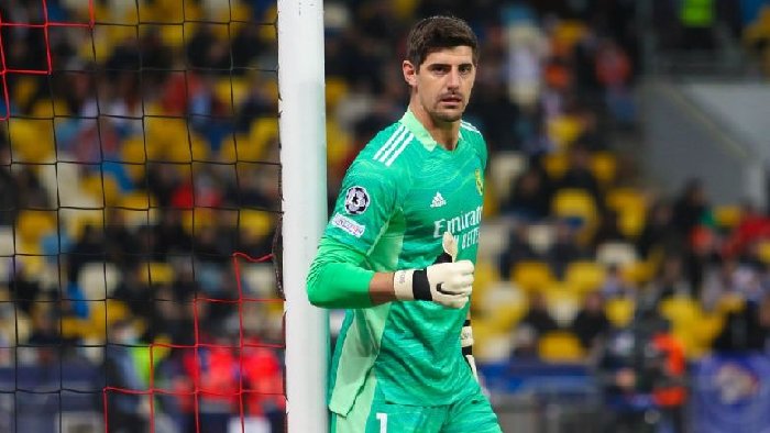 Why do goalkeepers wear different colors?
 -
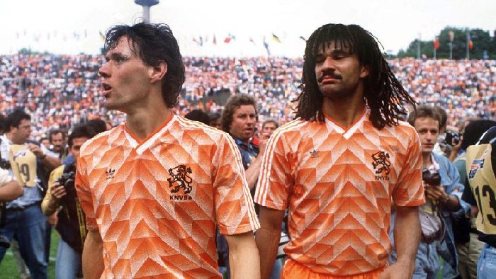 Netherlands football kit history: The 5 most iconic shirts ever made
 -
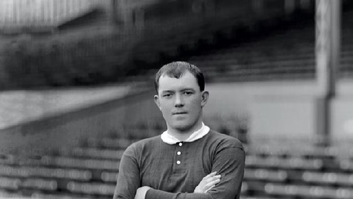 Who scored the first goal at Old Trafford?
 -
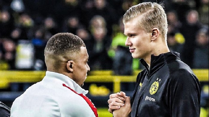 Who is better: Haaland or Mbappé?
 -
 Dani Olmo's position at Barcelona explained: Flick’s most flexible player
 -
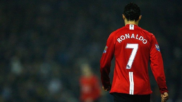 All Cristiano Ronaldo's jersey numbers revealed: How CR7 was born
 -
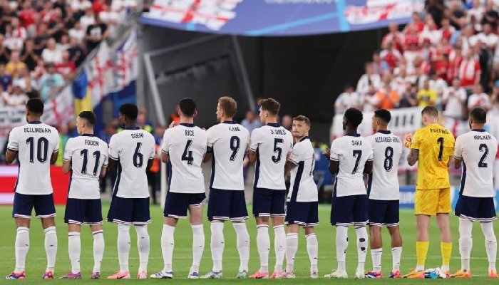 England national football team squad for the 2026 World Cup: Could Foden and Palmer be left out?
 -
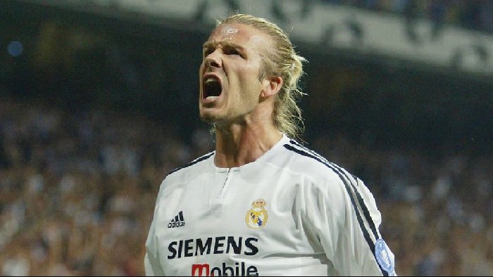 Why did David Beckham retire?
 -
 How much did Arsenal buy Kai Havertz?
 -
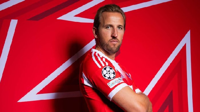 How much did Bayern Munich pay for Harry Kane?